Atlassian | Confluence
UX Strategy for Confluence web roadmap

Overview
As a Product UX Designer on the Growth Team, my mission was to define a clear product vision and strategic roadmap to guide two years of development and improve acquisition, activation, and retention. The goal was to align business goals with user-centric design, drive sign-up growth, and increase trial-to-paid conversions.
Challenges
Consolidating Disparate Research
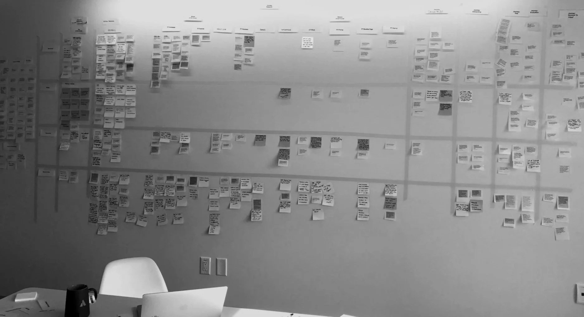
A significant volume of qualitative and quantitative research had been done across teams, but insights were scattered. Organizing and synthesizing it into a unified perspective was resource-intensive and complex.
Cross-Functional Stakeholder Alignment
The product experience spanned several stakeholders—Marketing, SEO, Data, and Product Managers—each with different goals. Gaining alignment on a shared UX strategy was critical but challenging.
No Unified Company Product Vision
There was no clearly articulated product vision or strategy. This meant we had to both define the long-term vision and fill key research and data gaps to support it.
Accessibility & Performance Gaps
Lighthouse audits revealed low scores in accessibility and performance, due to issues like incorrect headline hierarchy and tab order, poor color contrast, missing interactive user states and broken mobile experiences.
These not only impacted usability but also affected SEO and sign-up conversion rates.
-
Planned and conducted qualitative interviews and quantitative data analysis
Consolidated and synthesized existing cross-functional research
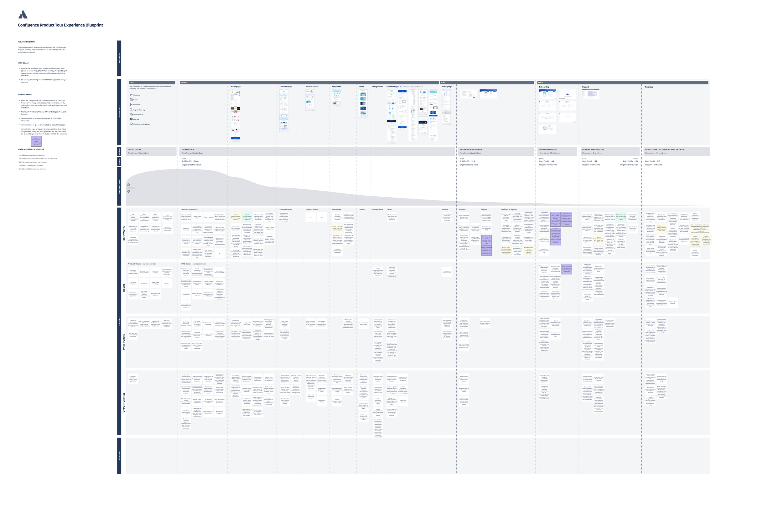
Created user journey maps and data visualizations to reveal pain points
Led stakeholder workshops to build alignment and uncover product opportunities
Defined and presented a two-year roadmap balancing business goals with user needs
Redesigned the information architecture for better content findability
Wrote communication guidelines for consistent voice, tone, and UX copy
Transitioned visual design from abstract illustrations to real product screens
Built a library of reusable UI patterns for efficiency and consistency
Improved the signup and onboarding flow to drive trial engagement and purchases
Implemented accessibility improvements that raised Lighthouse scores significantly
Process and Solutions
PROCESS
Research
Consolidation of the previous 2 years of research
Prepared and conducted 1:1 user interviews with potential SaaS purchasers to understand the software acquisition processes for different industries and company sizes
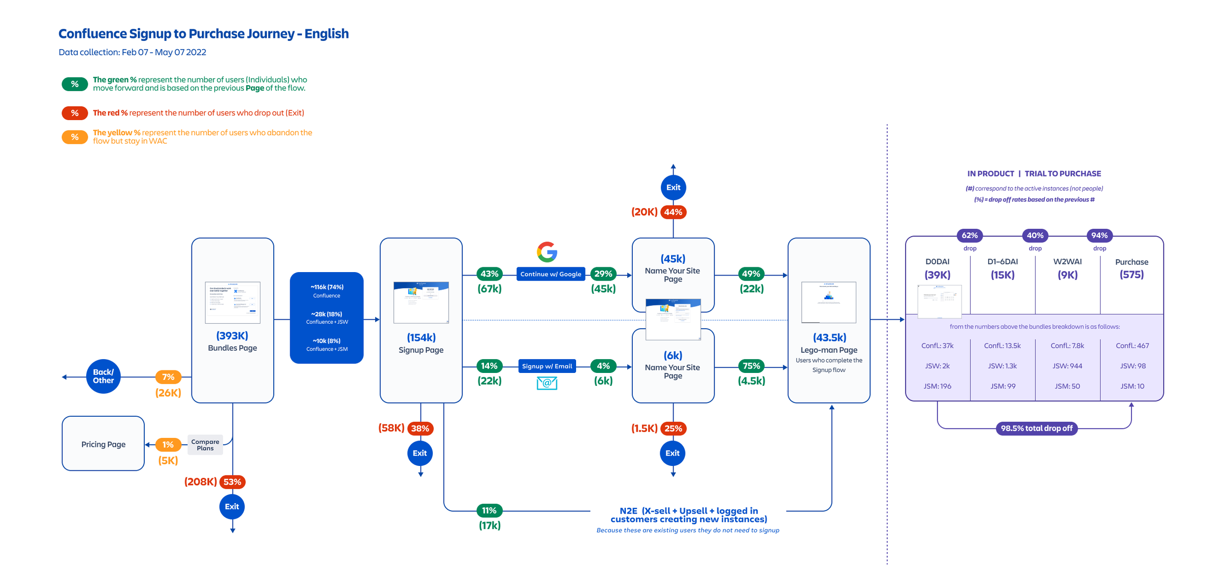
Comissioned specific quant. data for each step of the signup flow and onboarding to understand drop-off rates and friction points through data visualization artifacts
Conducted competitive audits
SOLUTIONS
Product Vision & Roadmap
Created a comprehensive journey map to help visualize the journey funnel and identify opportunities
Partnered with PM to define a clear product vision, strategic themes, and plan of action
Created and socialized a two-year roadmap, prioritizing features by impact on user experience and growth goals
Identified a series of experiments and prioritized them for efficiency in obtaining results
IMPACT
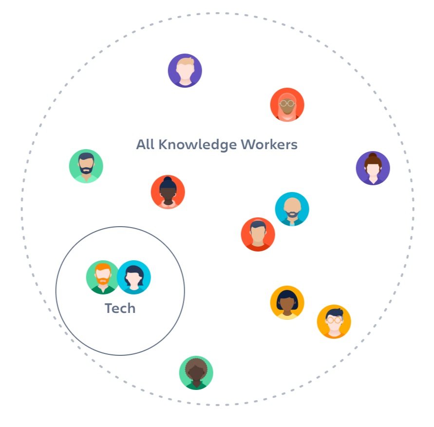
Identified a new critical user persona: trialing customers.
These users had a different set of needs from the Evaluators persona.Increased trust that facilitated approvals
Got a thorough understanding of our customers and their needs while evaluating software purchase, reducing ambiguity during our strategic planning of the roadmap, and gave us confidence that we were on the right track

PROCESS
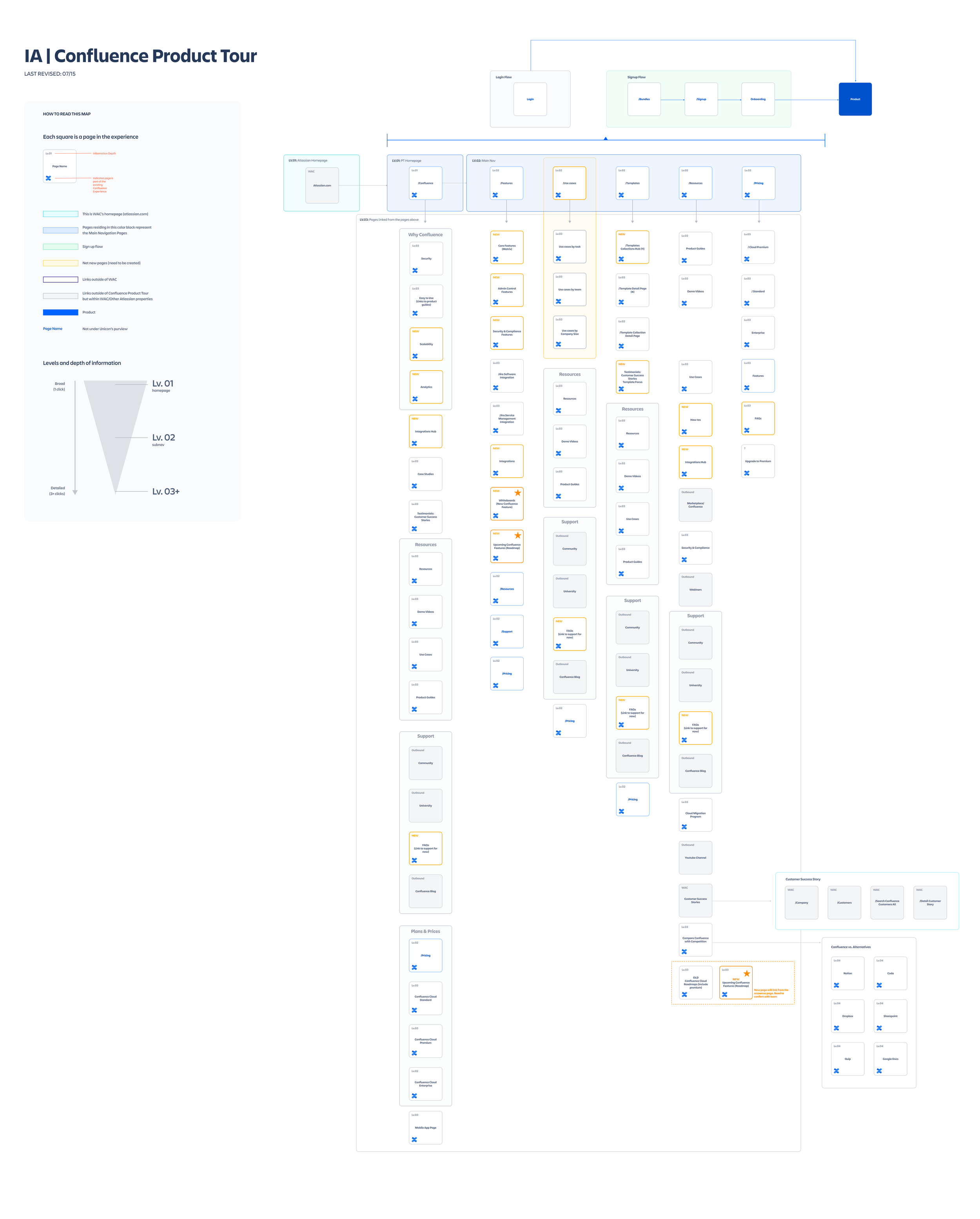
Create Information Architecture map
Understand page-level information architecture and propose improvements
Establish and document clear product goals and mission, and evangelize among all stakeholders
Used card sorting and tree testing to optimize information categorization
SOLUTIONS
Improve navigation
Revised the taxonomy to use words that potential customers understand
Developed a user’s mental model to simplify navigation
Reordered and prioritized pages and information to serve product personas at the right moment of their journeys and foster discoverability
Created a modular approach to page-level IA to facilitate experimentation of content order and messaging
Removed and relinked ghost pages
IMPACT
24-30% increase in quality signups
Significantly reduced cognitive load and increased engagement and number of page views
SOLUTIONS
Design and Content Opportunities
During our research, we uncovered two areas for design improvement:
Content
The site content was filled with ambiguous marketing jargon and, at times, hard to understand due to the language being too technical. I developed UX writing guidelines for clarity, consistency, and tone, eliminating most of the ambiguous marketing lingo and replacing it with straightforward informationDesign
Replaced abstract visuals with screenshots of the actual product to reinforce value, set expectations and help potential customers understand the product, bridging the gap between user expectation and reality
IMPACT
23% increase in trial signups from non tech workers
Due to clear language8-30% overall signup increase
for unique pages with improved language and replaced images
SOLUTIONS
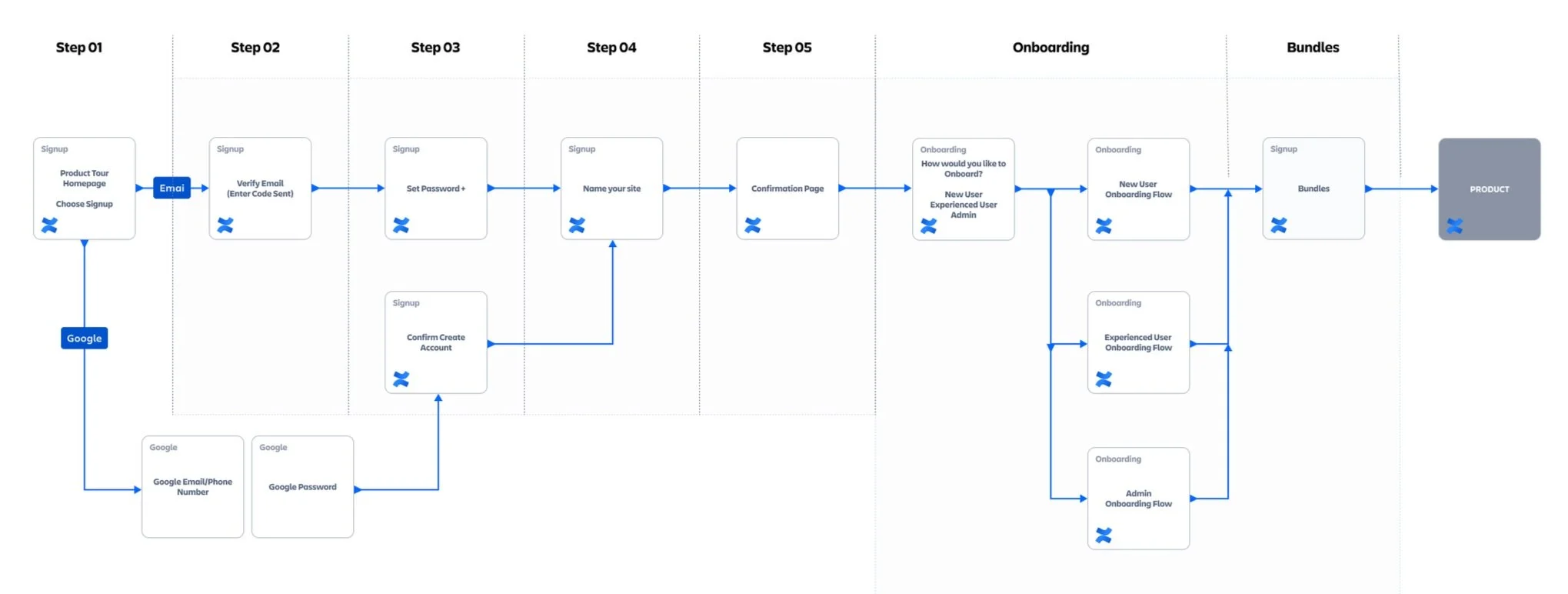
Improve Signup flow
Redesigned the sign up flow, emphasizing clear value propositions, consolidating steps, eliminating bad friction, and improving CTAs.
Reduced the number of sign-up steps from 8 to 4, including removing bundle screens from the flow
Simplified email verification
Modernized email validation and password screens by adding clear guidelines for password creation
Updated onboarding and simplified interface and copy to help reduce ambiguity Resulting in
IMPACT
Reduced overall drop-off rate by 59%
after removing the bundle screen, which was the first screen of the flow with a high ddrop-off rateIncreased user return after email verification
Reduced drop-off rate by 36%
after improvements to password creation28% improvement in D1-6 (Day 1-6 of the trial period) engagement and 54% in full purchases
Video showing the new signup experience
Redesign Signup & Trial Experience
Streamlined the signup form with progressive disclosure
Added onboarding nudges and feature education during trial